
You probably remember them from school: overlapping circles with scribbles in the middle that somehow made confusing math questions look almost elegant. That’s a Venn diagram.
The tool looks simple, but it has traveled far beyond classroom chalkboards. It shows up in data science, business reports, and even in casual “meme” culture when people want to compare quirks of everyday life.
What makes it stick is its clarity. In a single picture, you can see how groups overlap, where they stay separate, and what falls outside entirely.
Let’s take a walk through what Venn diagrams really are, how they’re built, why they matter, and plenty of easy examples you can use to see their power in action.
Quick Definition
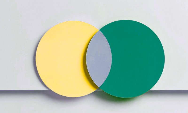
A Venn diagram is a picture of sets. Each circle (or other closed curve) stands for one set. Where circles overlap, you’re looking at elements that belong to more than one set.
Where they don’t overlap, you’re seeing elements unique to each. Outside all circles, you’ve got everything that doesn’t belong.
That’s the short version. But the usefulness runs deeper. They are a bridge between raw lists of items and the logical structures that mathematicians, scientists, and analysts depend on.
Why People Use Venn Diagrams
The appeal is obvious once you’ve tried them:
- They make relationships visible at a glance. You don’t need to scan tables or formulas. The picture explains itself.
- They are great for comparisons. Features of products, survey categories, competing ideas – if you want to see what overlaps and what doesn’t, Venn is your friend.
- They support reasoning. In set theory, logic, and probability, Venn diagrams help ground abstract rules with a visual.
A Short History
The Venn diagram is named after John Venn , an English logician from Cambridge. In 1880, he published a paper introducing his diagram as a way to represent logical propositions visually.
The diagrams were fully explained in his 1881 book Symbolic Logic. What made Venn’s idea special is that he included all possible logical relations among sets, not just the ones that happened to occur.
Earlier, Leonhard Euler had created circle diagrams showing actual relations, but Venn’s insistence on completeness made his design the standard.
- For biography: Britannica has a concise entry on John Venn.
- For the original text: his 1880 paper is publicly available online.
- For philosophy enthusiasts: the Stanford Encyclopedia of Philosophy has an excellent article on diagrams in logic.
Venn vs Euler Diagrams
Many people confuse them, but there’s a clear distinction.
| Feature | Venn Diagram | Euler Diagram |
| What it shows | All possible logical relations | Only the actual relations in the case |
| Empty regions | Always included, even if empty | Often left out |
| Typical use | Logic, set theory, teaching probability | Concept maps, general illustration |
The easiest way to remember: if you want every overlap possible , pick Venn. If you want only what exists in reality, Euler is often cleaner.
Anatomy of a Venn Diagram
The pieces are simple:
- Circles or curves: Each stands for a set.
- Labels: Words or symbols that identify each set.
- Regions: The overlapping and non-overlapping parts of the circles.
- Marks or shading: Indicate emptiness or presence. Logic textbooks often shade an area to show “nothing here” and use an x to mark “at least one item here.”
The Simplest Examples
Sometimes the clearest way to see how a Venn diagram works is through everyday situations. Let’s sketch a few easy ones.
Example 1: Restaurants
Set A = Italian restaurants in your city.
Set B = Restaurants with vegan options.
- A only: Italian restaurants without vegan options
- B only: Non-Italian restaurants with vegan options
- A ∩ B: Italian restaurants with vegan options
- Outside both: everything else
Example 2: Students
Set M = Students in Math Club.
Set S = Students on the Soccer Team.
The overlap shows who does both. Each name fits neatly into a region.
From Picture to Set Notation
View this post on Instagram
Venn diagrams aren’t just doodles. They mirror formal set operations:
- Union (A ∪ B): in A, or in B, or both.
- Intersection (A ∩ B): in A and B.
- Complement (Aᶜ): not in A.
- Difference (A \ B): in A but not in B.
How Venn Diagrams Support Probability
Probability rules are notorious for tripping people up. Venn diagrams are the cheat code.
Addition Rule
P(A ∪ B) = P(A) + P(B) − P(A ∩ B)
The subtraction avoids double-counting the overlap. A sketch with overlapping circles makes that instantly obvious.
Example
Out of 200 students:
- 90 like basketball (A)
- 80 like volleyball (B)
- 30 like both
So, 90 + 80 − 30 = 140 like at least one. Probability = 140 / 200 = 0.70.
Disjoint vs Independent
- If disjoint: no overlap, so P(A ∪ B) = P(A) + P(B).
- If independent: overlap equals P(A)P(B). The diagram helps visualize but doesn’t prove independence.
Three-Set Examples You Can Use Right Now
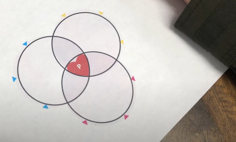
Three-set Venns create seven regions. Perfect for slightly richer comparisons.
Example 1: Customer Research
- A = watched a product video
- B = added to cart
- C = used a coupon code
Looking at overlaps tells you how content, carting, and promotions interact.
Example 2: Health Behaviors
- V = vaccinated
- M = wore masks indoors
- T = tested regularly
Public health analysts can map exact profiles.
Example 3: College Admissions
- H = GPA above 3.7
- S = high test score
- E = extracurricular leadership
H ∩ S ∩ E shows top applicants. E only shows potential leaders who shine outside academics.
How Many Sets Can You Show?

Two and three are common. Venn himself constructed a four-set diagram using ellipses. With enough creativity, you can design diagrams for any number of sets, but beyond three they get messy fast.
Mathematicians study elegant symmetric designs for five or more, but in practice, more than three is rare outside specialized research.
Easy Examples for Learners
Sometimes the best way to see how a Venn diagram works is to plug in simple, everyday examples. Let’s look at a few that make the idea click instantly.
Animals
- F = Animals that can fly
- B = Animals that are birds
Eagle goes in F ∩ B. Penguin in B only. Bat in F only. Dolphin outside both.
Numbers
Universal set U = 1 to 30
E = Even numbers
M = Multiples of 3
Overlap E ∩ M = {6, 12, 18, 24, 30}.
E \ M = even numbers not multiples of 3.
Cars
A = Features of Car A
B = Features of Car B
Overlap = shared features. Differences show dealbreakers.
How to Draw a Clear Venn Diagram

- Pick meaningful sets.
- Label clearly and briefly.
- Decide the universe (everything under consideration).
- Place each item once.
- Add numbers if data-driven.
- Stick to two or three sets for clarity.
Common Mistakes
- Forgetting the overlap: leads to double-counting.
- Mixing with Euler diagrams: different goals.
- Overcrowding with four or five circles: unreadable.
- Misinterpreting area size: standard Venns are not proportional unless specially drawn.
Where Venn Diagrams Show Up in Real Life
- Education: teaching sets, logic, probability.
- Statistics and data science: probability rules, event overlaps.
- Computer science: states, properties, data organization.
- Business: product comparisons, market analysis.
- Humanities and social sciences: thematic overlaps, author influences.
Quick Problem-Solving with Venn
Sometimes the fastest way to cut through survey counts or set questions is to sketch a Venn. A quick diagram can solve the puzzle in seconds.
Task 1: Two Categories
Class of 40: 22 like tea, 18 like coffee, 10 like both.
Count = 22 + 18 − 10 = 30.
Task 2: Three Categories
100 respondents:
- 40 subscribe to A
- 35 to B
- 30 to C
- 12 to A and B
- 10 to B and C
- 8 to A and C
- 5 to all three
Fill the diagram step by step. You’ll avoid mistakes like double-counting.
Deeper Reading and Fun Facts
- Philosophical side: Stanford Encyclopedia of Philosophy covers diagram logic.
- Symmetry: American Mathematical Society explores symmetric designs for five or more sets.
- Origins: Oxford Reference tracks how Venn’s diagrams became mainstream.
- Primary source: Venn’s own 1880 paper shows his original ideas.
FAQs
Wrap Up
Venn diagrams are one of those rare tools that feel both obvious and profound. They’re simple to draw, just circles on paper, but they anchor logic, probability, and comparison in a way almost everyone can grasp.
Next time you need to explain an overlap, compare products, or make sense of survey data, grab a pen and sketch two circles. Chances are, the fog will lift, and the picture will do the talking.